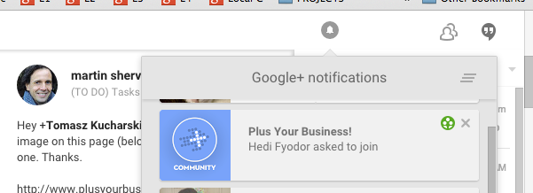
A quick tip for community owners on the difference between you logo/image being displayed on desktop to mobile.
As you can see, here is how it displays on a desktop:
And this is how it displays on a mobile:
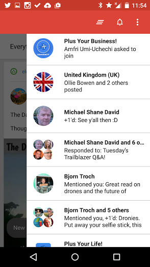
As you can see, the mobile version is in a circle, but desktop is in a square.
In the example above, neither look 'great' in notifications.
And, as you well know, these details really matter when you are building your brand.
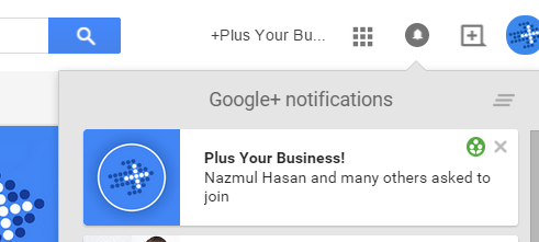
In PYB, we have jumped around many images, but now the Academy is established, we will be moving the rockets into the higher Levels, and having the arrow back in the main PYB community.
Note:
For those looking at dimensions for a community image then it would be 200 x 250 (displaying the area shown as 'safe' below.)
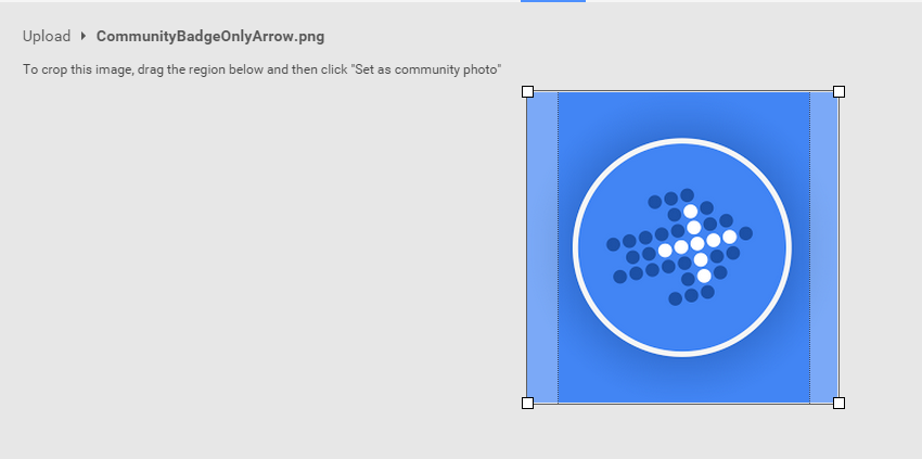
Image credit: http://services.google.com/fh/files/misc/googleplus-partner-playbook-august-2014.pdf