We live in hectic and restless times. Consumers have less and less patience, and companies are using many different methods when competing for their attention. Today, getting just a second of their time is difficult enough, let alone making them convert or buy.
In such circumstances, quality visuals can be very valuable for businesses. Our brains process images in as little as 13 milliseconds– that’s much faster than they process any other type of info. In addition, 90% of the information transmitted to the brain is said to be visual. So if you want to make a quick impact on consumers and make them remember your brand or your product, smart use of visual content can be hugely helpful.
That’s why it’s crucial for landing pages to include carefully selected, well-designed visuals. The main purpose of the landing page is to encourage people to convert. To do that, it has to:
- promptly grab the user’s attention
- evoke the right emotions
- provide succinct info about the product
- suggest how a product can solve the user’s problem
- clearly indicate how a consumer can buy the product
This is done with a clever combination of colors, shapes, symbols, and words.
To illustrate how to do this properly, we’ll show you some examples of companies across various industries that have created effective, well-optimized landing pages. As we walk you through these examples, we’ll highlight the elements and aspects of a landing page you should pay the most attention to.
Zoma
Let’s start with Zoma, an online mattress retailer. It’s remarkably important that your visuals stimulate the right emotions in people belonging to your target market. And who usually buys mattresses? People whose beds are old and/or uncomfortable. People who are likely tired, stressed, and sometimes even completely burned out.
.png?width=600&name=Image%202%20(1).png)
Source: zomasleep.com
That’s why a huge photo of a large, cozy double bed is a great idea in this context. It will release just the right amount of happy hormones to keep a visitor interested and engaged. The mattress is then further dissected to show the potential customer why it’s comfortable and induce an even greater feeling of relief and relaxation.
In fact, all the elements on this page work together to create this feeling. A minimalist color palette and the abundance of whitespace allow your eyes to rest while scrolling through the page. The only visual element that contrasts this vibe is a little countdown feature in the top-right corner. Its purpose is to create a sense of urgency and push people to convert, but in a well-balanced, non-intrusive way.
Muzzle
Designers from Muzzle showed a great deal of ingenuity in creating their homepage. Muzzle is an app that automatically silences your on-screen notifications as soon as you start screen sharing.
One of the crucial things to have in mind when designing a landing page is that you need to address a certain problem that consumers face and that you can solve. Muzzle does this by recreating an embarrassing situation – you have fake notifications flying in from the right side of your screen to show you what can happen if you forget to turn them off manually.
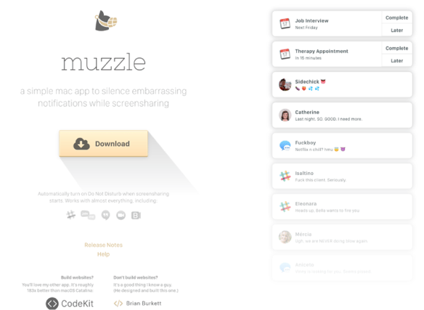
Source: muzzleapp.com
The messages are funny, amusing, and very impactful. They make us uncomfortable even though they’re fake. Just imagining something like this can happen during an important presentation is embarrassing enough, and it’s an excellent way of reminding people of a (potential) problem, offering a solution, and encouraging them to buy the product.
Heystack
Heystack is an organizational tool that simplifies managing business processes and operations. Their landing page uses an interactive, moving image of a huge and complicated machine that should remind the business owners and executives just how difficult it is to manage the inner workings of a company.
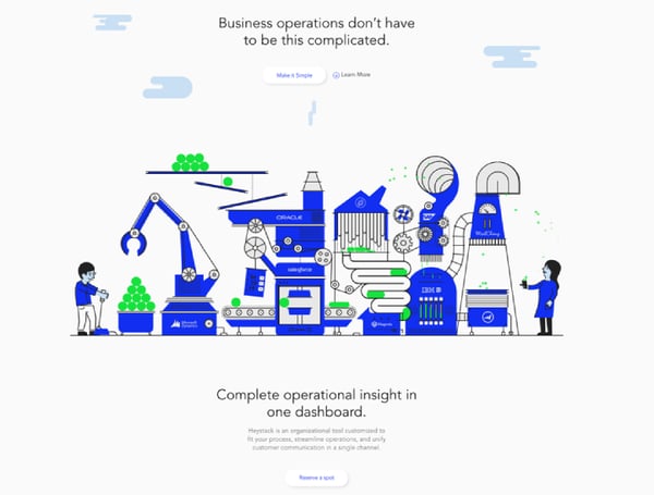
Source: heystack.is
But once you click on this image, the whole machinery disappears and everything is compressed into a charming human-sized robot that does all the work instead. The robot, of course, is a symbolic representation of their software. So there it is, all in one visual – there’s a problem, there’s a solution, and there are all the feelings that should accompany each of them.
There are two more visual elements that Heystack handles well. Firstly, they use screenshots to showcase what their software looks like and what a user can expect from it.
Secondly, they understand that when you’re advertising something digital or intangible, it’s best to represent it in a physical form as well. Hence, one of the screenshots is displayed on a mobile screen, which helps potential customers visualize the product.
Zenmaid
The use of video on your website or social media is proven to boost basically every important aspect of your digital marketing. Marketers know this and use them for all kinds of purposes, including improving the performance of their landing pages.
Zenmaid a maid service scheduling software, is a great example. Videos are best utilized when you need to explain how your product works to the users. Zenmaid’s animators have created a nice little video that covers the basics of how it functions and what benefits you can get from using it.
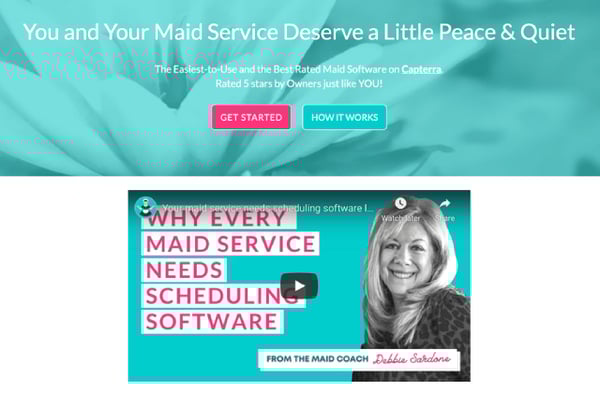
Source: zenmaid.com
They also employ another feature that can make your brand more relatable for consumers – photos of people. These photos should show someone your target audience can identify with or someone that will simply appeal to them. That’s why Zenmaid has put a large image of a happy, successful woman in the key area of their landing page, just above the fold.
Tesla X
A landing page can also serve for branding purposes very successfully. It’s always important to sell, but sometimes, it’s boosting your brand image that contributes the most to your bottom line in the long run. That’s especially the case with premium brands such as Tesla.
If you want your landing page to improve your branding efforts, it has to appeal to your target audience and provide valuable information to them. That’s why the Tesla X landing page is full of large, classy, high-res images and videos of this car looking flawless and doing what it does best. Tesla is a kind of company that can’t contribute to their brand image with cute animations or colorful illustrations, but a white Tesla and a white CTA on a white background can do the trick.
.png?width=600&name=Image%206%20(1).png)
Source: tesla.com
Another great thing about this page is that it’s simple and basic, but with just a few clicks, even the biggest of car geeks can easily find out everything they want to know about the car. The entire page is quick, responsive, and beautifully designed, just like Tesla X is meant to be.
Bear CSS
It’s never recommendable to make your landing page cluttered with info or unnecessary design features. Especially if you offer a simple service that can be explained in just a few words and images.
A good example is Bear CSS, simple software that converts HTML files to CSS. There’s a nice, neatly drawn background that makes the page lively and colorful, a drag-and-drop window, and an easily recognizable CTA button.
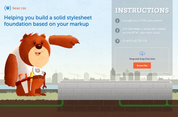
Source: bearcss.com
Another detail that’s worth mentioning is the illustrated bear pointing at the CTA button, thus reinforcing its visibility, just in case. Using this sort of directional cue is a widespread strategy that can help you increase your conversion rate by a few percent, especially when your landing page contains tons of text and different design elements.
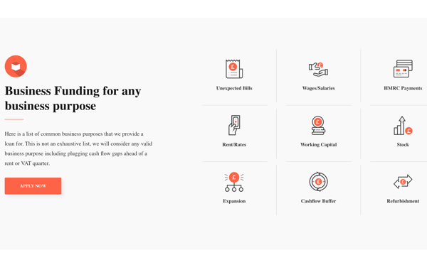
Cubefunder
Some services are a bit more detailed and complex to understand, so they can’t be explained with a few words and directional cues. Offering business loans is one of them. Nevertheless, you can also use visuals here to help people comprehend how your business works. Let’s check how Cubefunder did it.
Source: cubefunder.com
Notice how this landing page is full of small icons that illustrate certain words and phrases. The reason why this helps is simple – when you’re required to use a lot of text, people will naturally tend to scan the page in order to find the exact kind of info they need.
With these custom illustrations, people will find it easier to detect info relevant to them. The illustrations need less time to grab the viewer’s attention and are processed more quickly than words. This way, users will be naturally directed towards parts of the page they care about.
At the end of the page, we can see another valuable use of video on a landing page – a testimonial video. Consumers generally believe online ratings and reviews, and testimonial videos can be particularly convincing in this respect. But only if they’re genuine and authentic, obviously.
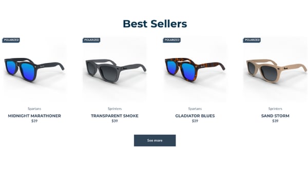
Runners Sunglasses
Finally, let’s look at another brand that’s just done a great overall job with their landing page, without being overly flashy or complicated.
The Runners Sunglasses homepage offers clear product photos that show how the products look from another angle when your cursor hovers over them. There are also two hero images that target the population of runners and athletes, aiming to evoke feelings of determination and tenacity.
Source: runnersathletics.com
They share their Instagram feed at the bottom of the page as well. This can be a great tactic if your social media game is strong enough. Smart use of visuals that you already shared on your social networks can show consumers what your brand is about and affect their buying decisions on a subconscious level.
In Closing
There are numerous things you need to have in mind when optimizing your landing pages’ visuals to maximize conversions. But the most important one to remember is that every brand is unique, so the same set of rules won’t apply equally to all. Sometimes, not playing by the rules will bring the best results.
The bottom line is – get to know your target market and try figuring out what sort of visual elements will influence them most. Be open to their feedback, monitor all the important metrics, perform A/B testing on a regular basis, and adapt accordingly. It’s the only way to get the most out of your landing pages in the long run.
About the Author
Natasha is a lady of a keyboard and one huge geek. She has a rich history of working in the branding, digital marketing, and business growth related fields. Natasha is always happy to collaborate with awesome blogs and share her knowledge all around the web. To see what she is up to next, check out her Twitter Dashboard.