Ecommerce brands are always looking for effective ways to boost conversions and sales. And that's no surprise. After all, the success of a business depends on its capability to consistently make a profit. Plus, to ensure longevity, brands need to generate extra funds that they can invest in growth.
When done right, interactive website features can provide that required boost. Moreover, they can make significant positive contributions to brand authority, consumer satisfaction, and stronger relationships between your brand and your audience.
So what are the benefits you can expect by including interactive features on your site? And will they be enough to stop the average CR drop that's been happening in 2021? Let's find out.
Are Website Conversions Going Down?
Making sense of ecommerce conversion rate statistics takes a lot more than thinking you should aim for the average of 2.5%. Not only do your conversions depend on product category and seasonal consumer behavior, but they're also impacted by the increasing number of online shoppers.
For example, a report from IRP shows that the average conversion rate dropped 0.41% between May 2020 and May 2021. Research from Oberlo also illustrates this trend, showing that since April 2020, the only quarter that reached a 2.5% CR was Q4, which coincides with the Christmas shopping season. But, looking at the same reports, there are some positive trends as well. According to IRP, the Average Order Value went up by 22.36%. And the Average Sale Price of Items grew an astonishing 36.27%.
So why are conversion rates going down? Well, the reason may be our global shift towards online shopping. According to Statista, the number of digital buyers worldwide is expected to reach 2.14 billion in 2021. Additionally, the number of ecommerce stores is increasing daily. Therefore, it's safe to say that consumers now have way more options than they did in 2020 (before the Covid-19 pandemic when suddenly everyone wanted to shop online).
Still, it's taking more and more to convince buyers to pick a brand. Not only do consumers want to support businesses whose values coincide with their own, but they also want to be vowed by the design and functionality of ecommerce stores.
With this in mind, it's not a bad idea to start thinking about updates to your website. And, interactive website elements might just prove to be the thing that sets you apart from the competition.
So, if you're ready to improve ecommerce conversions by making small design changes, these are the ways you can do it with interactive web content.
Effective Ways to Use Interactive Website Features to Boost Ecommerce Conversions
1. Find Out What Consumers Need
One of the most straightforward ways to include interactive features on your website is to add them to your sign-up and opt-in forms.
When generating leads for your email marketing list, what you're essentially doing is investing in future customers. But, you have to keep in mind that the best way to turn potential buyers into people who repeatedly shop from your ecommerce store is to nurture them with the right content and offers.
Adding an interactive element to your sign-up and opt-in forms is a simple but effective way to collect information that will help you ensure you're staying relevant throughout your communications. And, best of all, it doesn't have to be extravagant to be effective.
For example, Aspesi allows potential customers to pick which product categories they wish to receive news about when signing up for the brand's newsletter. It's utterly simple, but it significantly improves the consumer experience by automatizing the audience segmentation process and preventing irrelevant information overload.
.png?width=475&name=aspesi%20(1).png) Source: aspesi.com
Source: aspesi.com
Another company that does this is GetSafe, though this brand's widget is a bit more extravagant. It leads visitors through several questions regarding their needs, then prompts them to leave their contact information. So, when a sales operator gets to the task of calling the new lead, they already have a host of relevant info about the consumer, allowing them to prepare better and increase their chances of making a sale.
.png?width=700&name=getsafe%20(1).png) Source: getsafe.com
Source: getsafe.com
2. Help Web Visitors on Their Buying Journey
Another super-popular way to include interactive elements in your ecommerce store is to make them a part of the product selection process.
Essentially, you have to remember that the people who arrive at your landing pages won't always be in the same stage of the buying funnel. Especially when you're running PPC campaigns. So, to prevent bounces (and unnecessary spending), you can create an interactive feature that will help them pick the perfect product for their needs.
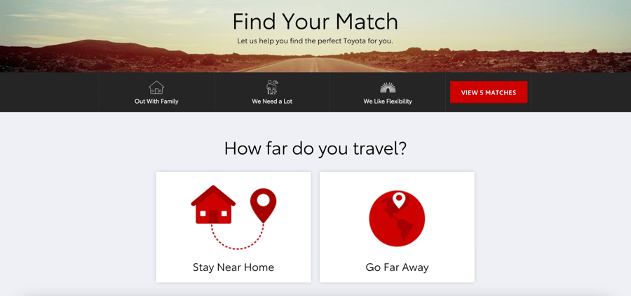
This is what Toyota does with its Find Your Match feature. By asking four simple questions, it narrows product recommendations down from a dozen to three, allowing consumers to get to their ideal "match" as quickly as possible.
 Source: toyota.com
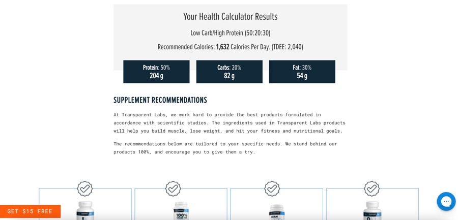
Transparent Labs does something similar on its Calorie Calculator page, where it leads web visitors through an in-depth survey. Once all questions are answered, the brand provides visitors with extensive information on reaching their fitness goals. What's interesting about Transparent Labs' approach is that it doesn't just offer product recommendations but includes educational links as well, allowing potential buyers to be fully informed before making a purchase.
 Source: transparentlabs.com
3. Use Interactive Elements to Describe Your Products
One of the disadvantages ecommerce has when compared to in-store shopping is that it doesn't allow consumers to touch and feel products. And, to 62% of people, this is a significant hindrance.
Fortunately, however, tech is advancing at a rapid rate. Not only do most ecommerce stores allow 360° product views. But some, like Jins, also allow consumers to try on products virtually.
 Source: jins.com
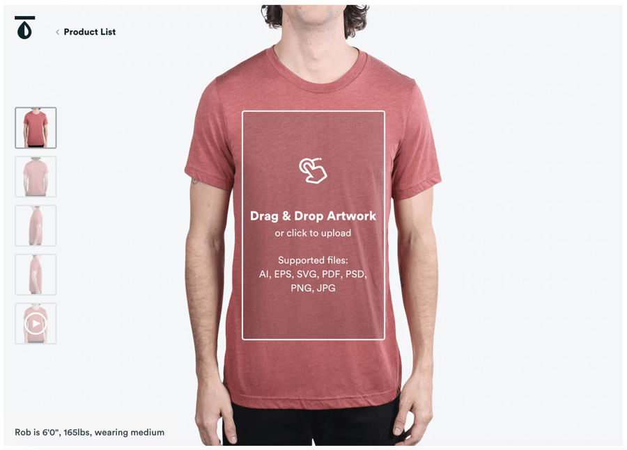
And some brands go even a step further. Real Thread, for example, allows web visitors to design custom products right from the brand's product pages. It supports color selection and image upload, helping potential clients get the best possible idea of what they can expect when they receive their package.
 Source: realthread.com
4. Software Previews
When coming up with website features that will help you improve conversions, you have to remember that one solution won't fit everyone's needs.
Yes, an ecommerce store selling clothing or gadgets will be able to implement some of the abovementioned interactive elements. But, when selling software, you won't get far with a 360° app view.
What could help you achieve the results you're after is adding an interactive element to your homepage.
Noisli is a brand that does this amazingly. Selling white noise software, the company decided that the freemium model wasn't doing enough to get its target conversion rates. So, it ventured to enrich its website with some of the app's functionalities, giving potential customers a preview of what they can expect from the full version of the app.
 Source: noisli.com
5. Increase Average Order Value
OK, so this method may not do much to increase your conversion rates. But, it will still benefit your business.
Focusing on average order value instead of conversion rates is a strategy that most advanced ecommerce sellers try to go after. The reasons are simple. Not only does a higher AOV put more money in your pocket, but it also saves you on shipping and handling costs. In other words, you don't have to sell to more people to boost your profits. You just have to sell more.
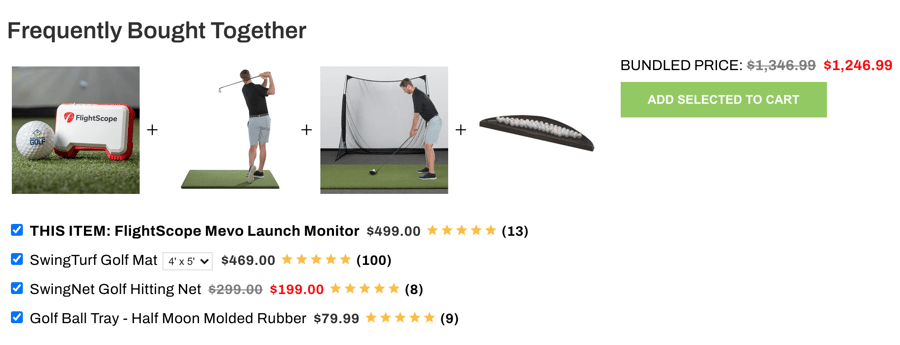
Interactive features, such as a "frequently bought together" section on your product pages can go a long way in helping you achieve this goal. If you check out this example from Rain or Shine Golf, you'll see that it doesn't just allow the seller to sell more products. It also benefits the buyer. Plus, the interactive feature helps consumers complete their product collection, so they make the most of their purchases at home.
 Source: rainorshinegolf.com
6. Engage Web Visitors Who Aren't Ready to Buy
Sometimes, you have to accept that a web visit won't end in a conversion. But, that doesn't mean you shouldn't still see those website visitors as potential clients. Sure, they may not be ready to buy from you now. But they could be a few months (especially if you establish yourself as an authority in your industry).
So, where do interactive features come in for this strategy?
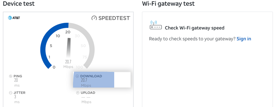
Well, a website widget can help you learn a lot about your target audience. Even if you don't frame the data collection process as a quiz. AT&T, for example, has a speed test widget on its website, where it allows anyone from anywhere to check their internet speed.
Source: att.com
Now, while a person currently with a different service provider won't jump ahead and sign up for the company's services, they will appreciate the free tips on how they can get more out of their internet connection. And, when the time comes to renew their contract with their current provider, they just might consider switching over to the brand that helped them with a problem they once had.
Another great way to engage audiences with interactive features is to use these to bring your content to life. If you check out this report by Adobe (which is chock-full of valuable information for marketers), you'll see that the design adapts as web visitors scroll. This draws attention to the most important info, ensuring that readers get exactly what they came for and walk away with a positive impression of the brand.
7. Use Live Chat & Chatbots
It would be practically impossible to wrap up this article about interactive web features without giving live chat and chatbots the praise they deserve.
Not only are these the most interactive type of feature you can include on your site (what's more interactive than communicating with another person?). But, they're also proven to increase ecommerce conversions. So why not include them on your site?
To get the absolute best results, you should look for a solution that allows you to create automatized chat flows, like HubSpot. That way, you won't lose leads when your agents aren't immediately available to talk.
8. Internal Links
Last but not least, to help your customers interact with your site in a way that will increase your chances of making a sale, don't forget to include internal links on your pages.
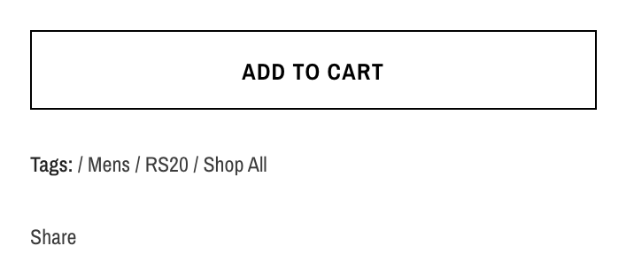
This is easy to do on most ecommerce platforms by adding tags, as done below by Thorsun. Plus, it will help with your site's SEO, which is an added bonus when trying to move your business forward.
 Source: thorsun.com
Final Thoughts
As you can see, there are numerous ways you can use interactive website features to improve ecommerce conversions.
However, the thing to remember is that boosting conversion rates isn't the only benefit you stand to gain by making your website more attractive and user-friendly. Even if you only manage to increase the number of readers on your blog, you'll still be looking at gains in the future. But, to do that, you have to leave a stellar impression.
So don't hesitate to think outside the box and come up with new ways to answer consumer needs. Sure, it may have never been done before. But we live in the world of AR and wearable technology. So making your website do more than just look pretty is kind of the direction you have to move in anyways.

Ecommerce brands are always looking for effective ways to boost conversions and sales. And that's no surprise. After all, the success of a business depends on its capability to consistently make a profit. Plus, to ensure longevity, brands need to generate extra funds that they can invest in growth.
When done right, interactive website features can provide that required boost. Moreover, they can make significant positive contributions to brand authority, consumer satisfaction, and stronger relationships between your brand and your audience.
So what are the benefits you can expect by including interactive features on your site? And will they be enough to stop the average CR drop that's been happening in 2021? Let's find out.
Are Website Conversions Going Down?
Making sense of ecommerce conversion rate statistics takes a lot more than thinking you should aim for the average of 2.5%. Not only do your conversions depend on product category and seasonal consumer behavior, but they're also impacted by the increasing number of online shoppers.
For example, a report from IRP shows that the average conversion rate dropped 0.41% between May 2020 and May 2021. Research from Oberlo also illustrates this trend, showing that since April 2020, the only quarter that reached a 2.5% CR was Q4, which coincides with the Christmas shopping season. But, looking at the same reports, there are some positive trends as well. According to IRP, the Average Order Value went up by 22.36%. And the Average Sale Price of Items grew an astonishing 36.27%.
So why are conversion rates going down? Well, the reason may be our global shift towards online shopping. According to Statista, the number of digital buyers worldwide is expected to reach 2.14 billion in 2021. Additionally, the number of ecommerce stores is increasing daily. Therefore, it's safe to say that consumers now have way more options than they did in 2020 (before the Covid-19 pandemic when suddenly everyone wanted to shop online).
Still, it's taking more and more to convince buyers to pick a brand. Not only do consumers want to support businesses whose values coincide with their own, but they also want to be vowed by the design and functionality of ecommerce stores.
With this in mind, it's not a bad idea to start thinking about updates to your website. And, interactive website elements might just prove to be the thing that sets you apart from the competition.
So, if you're ready to improve ecommerce conversions by making small design changes, these are the ways you can do it with interactive web content.
Effective Ways to Use Interactive Website Features to Boost Ecommerce Conversions
1. Find Out What Consumers Need
One of the most straightforward ways to include interactive features on your website is to add them to your sign-up and opt-in forms.
When generating leads for your email marketing list, what you're essentially doing is investing in future customers. But, you have to keep in mind that the best way to turn potential buyers into people who repeatedly shop from your ecommerce store is to nurture them with the right content and offers.
Adding an interactive element to your sign-up and opt-in forms is a simple but effective way to collect information that will help you ensure you're staying relevant throughout your communications. And, best of all, it doesn't have to be extravagant to be effective.
For example, Aspesi allows potential customers to pick which product categories they wish to receive news about when signing up for the brand's newsletter. It's utterly simple, but it significantly improves the consumer experience by automatizing the audience segmentation process and preventing irrelevant information overload.
.png?width=475&name=aspesi%20(1).png) Source: aspesi.com
Source: aspesi.com
Another company that does this is GetSafe, though this brand's widget is a bit more extravagant. It leads visitors through several questions regarding their needs, then prompts them to leave their contact information. So, when a sales operator gets to the task of calling the new lead, they already have a host of relevant info about the consumer, allowing them to prepare better and increase their chances of making a sale.
.png?width=700&name=getsafe%20(1).png) Source: getsafe.com
Source: getsafe.com
2. Help Web Visitors on Their Buying Journey
Another super-popular way to include interactive elements in your ecommerce store is to make them a part of the product selection process.
Essentially, you have to remember that the people who arrive at your landing pages won't always be in the same stage of the buying funnel. Especially when you're running PPC campaigns. So, to prevent bounces (and unnecessary spending), you can create an interactive feature that will help them pick the perfect product for their needs.
This is what Toyota does with its Find Your Match feature. By asking four simple questions, it narrows product recommendations down from a dozen to three, allowing consumers to get to their ideal "match" as quickly as possible.
 Source: toyota.com
Transparent Labs does something similar on its Calorie Calculator page, where it leads web visitors through an in-depth survey. Once all questions are answered, the brand provides visitors with extensive information on reaching their fitness goals. What's interesting about Transparent Labs' approach is that it doesn't just offer product recommendations but includes educational links as well, allowing potential buyers to be fully informed before making a purchase.
 Source: transparentlabs.com
3. Use Interactive Elements to Describe Your Products
One of the disadvantages ecommerce has when compared to in-store shopping is that it doesn't allow consumers to touch and feel products. And, to 62% of people, this is a significant hindrance.
Fortunately, however, tech is advancing at a rapid rate. Not only do most ecommerce stores allow 360° product views. But some, like Jins, also allow consumers to try on products virtually.
 Source: jins.com
And some brands go even a step further. Real Thread, for example, allows web visitors to design custom products right from the brand's product pages. It supports color selection and image upload, helping potential clients get the best possible idea of what they can expect when they receive their package.
 Source: realthread.com
4. Software Previews
When coming up with website features that will help you improve conversions, you have to remember that one solution won't fit everyone's needs.
Yes, an ecommerce store selling clothing or gadgets will be able to implement some of the abovementioned interactive elements. But, when selling software, you won't get far with a 360° app view.
What could help you achieve the results you're after is adding an interactive element to your homepage.
Noisli is a brand that does this amazingly. Selling white noise software, the company decided that the freemium model wasn't doing enough to get its target conversion rates. So, it ventured to enrich its website with some of the app's functionalities, giving potential customers a preview of what they can expect from the full version of the app.
 Source: noisli.com
5. Increase Average Order Value
OK, so this method may not do much to increase your conversion rates. But, it will still benefit your business.
Focusing on average order value instead of conversion rates is a strategy that most advanced ecommerce sellers try to go after. The reasons are simple. Not only does a higher AOV put more money in your pocket, but it also saves you on shipping and handling costs. In other words, you don't have to sell to more people to boost your profits. You just have to sell more.
Interactive features, such as a "frequently bought together" section on your product pages can go a long way in helping you achieve this goal. If you check out this example from Rain or Shine Golf, you'll see that it doesn't just allow the seller to sell more products. It also benefits the buyer. Plus, the interactive feature helps consumers complete their product collection, so they make the most of their purchases at home.
 Source: rainorshinegolf.com
6. Engage Web Visitors Who Aren't Ready to Buy
Sometimes, you have to accept that a web visit won't end in a conversion. But, that doesn't mean you shouldn't still see those website visitors as potential clients. Sure, they may not be ready to buy from you now. But they could be a few months (especially if you establish yourself as an authority in your industry).
So, where do interactive features come in for this strategy?
Well, a website widget can help you learn a lot about your target audience. Even if you don't frame the data collection process as a quiz. AT&T, for example, has a speed test widget on its website, where it allows anyone from anywhere to check their internet speed.

Source: att.com
Now, while a person currently with a different service provider won't jump ahead and sign up for the company's services, they will appreciate the free tips on how they can get more out of their internet connection. And, when the time comes to renew their contract with their current provider, they just might consider switching over to the brand that helped them with a problem they once had.
Another great way to engage audiences with interactive features is to use these to bring your content to life. If you check out this report by Adobe (which is chock-full of valuable information for marketers), you'll see that the design adapts as web visitors scroll. This draws attention to the most important info, ensuring that readers get exactly what they came for and walk away with a positive impression of the brand.
7. Use Live Chat & Chatbots
It would be practically impossible to wrap up this article about interactive web features without giving live chat and chatbots the praise they deserve.
Not only are these the most interactive type of feature you can include on your site (what's more interactive than communicating with another person?). But, they're also proven to increase ecommerce conversions. So why not include them on your site?
To get the absolute best results, you should look for a solution that allows you to create automatized chat flows, like HubSpot. That way, you won't lose leads when your agents aren't immediately available to talk.
8. Internal Links
Last but not least, to help your customers interact with your site in a way that will increase your chances of making a sale, don't forget to include internal links on your pages.
This is easy to do on most ecommerce platforms by adding tags, as done below by Thorsun. Plus, it will help with your site's SEO, which is an added bonus when trying to move your business forward.
 Source: thorsun.com
Final Thoughts
As you can see, there are numerous ways you can use interactive website features to improve ecommerce conversions.
However, the thing to remember is that boosting conversion rates isn't the only benefit you stand to gain by making your website more attractive and user-friendly. Even if you only manage to increase the number of readers on your blog, you'll still be looking at gains in the future. But, to do that, you have to leave a stellar impression.
So don't hesitate to think outside the box and come up with new ways to answer consumer needs. Sure, it may have never been done before. But we live in the world of AR and wearable technology. So making your website do more than just look pretty is kind of the direction you have to move in anyways.