For someone visiting your website, all the pages are web pages but for a marketer, the pages can be divided into Homepage, Product/Service pages, and most important pages of a website i.e. Landing Pages. Homepage is the face of a brand, meant to introduce the brand to your visitor. Landing pages are the business aspect of your brand; people landing here are aware of your brand and are ready to progress to the next stage of the customer journey. So, a good user experience is a big factor while creating a landing page and the use of visuals are the best way to improve the aesthetics while being functional in assisting the conversions.
Let’s have a brief glance through the different visual types and how to use them in a landing page
Different Types of Visuals Used in Landing Pages
Graphs/ Charts / Data Driven Visuals
Landing pages need to demonstrate the effectiveness of your products/services and so you need to display lots of statistics and numbers to show your efficiency. Representing them as text may lead to visitors avoiding them in a glance. When you represent your data as visuals such as graphs or charts, the graphical representation helps to catch attention and engages the visitor.
In the example below by Planable, the landing page promotes downloading their report and to support the motive, they have shown the data in the form of visuals for easy consumption.

(Source: Planable)
Illustrations
Illustrations are hand drawn images of characters, scenery or a concept. The benefit of using illustration is that you can demonstrate any concept or abstract ideas and you only need an illustrator or a graphic designer. Illustrations give the element of fun to your landing pages and draw attention when paired with plain backgrounds. Depending on the scale of the images, illustrations are a quicker and cost effective way when compared to organizing photoshoots for real world images.
In the example below by Budibase, the hero image is a prominent illustration that immediately captures your attention.

(Source: Budibase)
Videos
Marketers who incorporate video into their campaigns, experience 34% higher conversion rates (Aberdeen Group). Right from explainer videos to user-generated content, videos are a great way to have story-telling in your landing pages. Videos allow marketers to convey truckloads of information without occupying equivalent space. Moreover, since the video on your landing pages only starts when the visitor clicks on them, it is a non-intrusive way of providing information.
Videos can be used in multitude ways. In the example below, Phrasee uses it to explain their product through a concept video.

(Source: Phrasee)
Messagebird has some interesting features and they use an explainer video to demonstrate these in their landing page.

(Source: MessageBird)
People gain trust faster when they see someone else getting benefitted by your products / services. So, why not proudly display your customer testimonials as a video on your page instead of a measly ticker window.
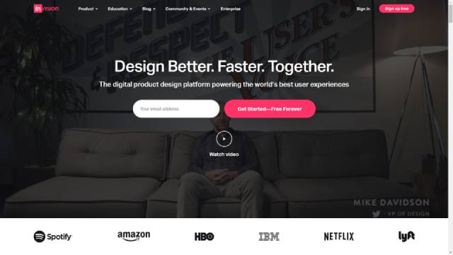
Invision is a great tool for sharing feedback on designs and used by the design departments of famous brands. The folks at Invision tapped on the potential of asking the design heads of different brands, who use their products, to provide a video testimonial. They featured the video as a subtle video background with the option to view the video for building visitors’ trust when they visit the landing page.

(Source: InvisionApp)
Icons
While images are predominantly used in landing pages, email designers are also experimenting with subtle icons that don’t hog the limelight but improve the overall aesthetics of the page. The advantage of using icons in a landing page is that you are not restricted in terms of use. Icons can be used independently and also in conjunction with text.
In the example below by Visla, icons are used to list out the services they provide.

(Source: Visla)
Wrap Up
Landing pages are an integral part of your marketing efforts. As long as the visual aspects in your landing page manage to draw the attention of your visitor at the right places, you can be sure of them converting. Those mentioned here highlight only some of the visuals you can use in your landing page. Check out the infographic “The use of Visuals in Landing Page” for a deep dive into other visuals to use in your landing page.
 Source: How to Use Visual Elements in Landing Page to Boost Conversions
About the author
Kevin George is Head of Marketing at Email Uplers, one of the fastest growing custom email design and coding companies, and specializes in crafting professional email templates, PSD to HTML email conversion and free responsive HTML email templates in addition to providing email automation, campaign management, and data integration & migration services. He loves gadgets, bikes, jazz and eats and breathes email marketing. He enjoys sharing his insights and thoughts on email marketing best practices on his blog.

For someone visiting your website, all the pages are web pages but for a marketer, the pages can be divided into Homepage, Product/Service pages, and most important pages of a website i.e. Landing Pages. Homepage is the face of a brand, meant to introduce the brand to your visitor. Landing pages are the business aspect of your brand; people landing here are aware of your brand and are ready to progress to the next stage of the customer journey. So, a good user experience is a big factor while creating a landing page and the use of visuals are the best way to improve the aesthetics while being functional in assisting the conversions.
Let’s have a brief glance through the different visual types and how to use them in a landing page
Different Types of Visuals Used in Landing Pages
Graphs/ Charts / Data Driven Visuals
Landing pages need to demonstrate the effectiveness of your products/services and so you need to display lots of statistics and numbers to show your efficiency. Representing them as text may lead to visitors avoiding them in a glance. When you represent your data as visuals such as graphs or charts, the graphical representation helps to catch attention and engages the visitor.
In the example below by Planable, the landing page promotes downloading their report and to support the motive, they have shown the data in the form of visuals for easy consumption.

(Source: Planable)
Illustrations
Illustrations are hand drawn images of characters, scenery or a concept. The benefit of using illustration is that you can demonstrate any concept or abstract ideas and you only need an illustrator or a graphic designer. Illustrations give the element of fun to your landing pages and draw attention when paired with plain backgrounds. Depending on the scale of the images, illustrations are a quicker and cost effective way when compared to organizing photoshoots for real world images.
In the example below by Budibase, the hero image is a prominent illustration that immediately captures your attention.

(Source: Budibase)
Videos
Marketers who incorporate video into their campaigns, experience 34% higher conversion rates (Aberdeen Group). Right from explainer videos to user-generated content, videos are a great way to have story-telling in your landing pages. Videos allow marketers to convey truckloads of information without occupying equivalent space. Moreover, since the video on your landing pages only starts when the visitor clicks on them, it is a non-intrusive way of providing information.
Videos can be used in multitude ways. In the example below, Phrasee uses it to explain their product through a concept video.

(Source: Phrasee)
Messagebird has some interesting features and they use an explainer video to demonstrate these in their landing page.

(Source: MessageBird)
People gain trust faster when they see someone else getting benefitted by your products / services. So, why not proudly display your customer testimonials as a video on your page instead of a measly ticker window.
Invision is a great tool for sharing feedback on designs and used by the design departments of famous brands. The folks at Invision tapped on the potential of asking the design heads of different brands, who use their products, to provide a video testimonial. They featured the video as a subtle video background with the option to view the video for building visitors’ trust when they visit the landing page.

(Source: InvisionApp)
Icons
While images are predominantly used in landing pages, email designers are also experimenting with subtle icons that don’t hog the limelight but improve the overall aesthetics of the page. The advantage of using icons in a landing page is that you are not restricted in terms of use. Icons can be used independently and also in conjunction with text.
In the example below by Visla, icons are used to list out the services they provide.

(Source: Visla)
Wrap Up
Landing pages are an integral part of your marketing efforts. As long as the visual aspects in your landing page manage to draw the attention of your visitor at the right places, you can be sure of them converting. Those mentioned here highlight only some of the visuals you can use in your landing page. Check out the infographic “The use of Visuals in Landing Page” for a deep dive into other visuals to use in your landing page.
 Source: How to Use Visual Elements in Landing Page to Boost Conversions
About the author
Kevin George is Head of Marketing at Email Uplers, one of the fastest growing custom email design and coding companies, and specializes in crafting professional email templates, PSD to HTML email conversion and free responsive HTML email templates in addition to providing email automation, campaign management, and data integration & migration services. He loves gadgets, bikes, jazz and eats and breathes email marketing. He enjoys sharing his insights and thoughts on email marketing best practices on his blog.