With so much business happening online in the modern age, methods for boosting efficiency, UX and all of the finer details of online shopping are at the heart of much innovation. There’s so much that can be achieved without too much work and effort. It’s also always satisfying to watch the edits and alterations you’ve made having an impact on your e-commerce company’s success. The vital stage of the shopper’s experience, where you can’t afford to let anything go wrong is the checkout page. Checking out should be the smoothest part of the whole shopping experience: you’re so close to closing a sale, why let anything go wrong now? To ensure that you are on top of this element to your site, maximizing your own chance of making as many sales as possible, you need to test your checkout page. The tests need to be thorough and diverse - anything that could throw your customer off will be detrimental to your sales and company as a whole. With that said, let’s get started looking into all of the ins and outs of checkout page testing.
Examine Your Payment Security
When a customer lines up in a store and exchanges cash for an item that they want, there is a beautifully reassuring simplicity to the moment, a fundamental moment of commerce. The exchange leaves both customer and seller feeling satisfied and secure. But all of this goes out of the window in e-commerce. “The payment gateway is one of your prime hotspots for losing customers. There is something that we haven’t quite wrapped our head around collectively, and that is giving money we can’t see, to people we can’t see for products we can’t see”, explains James Cartwright, e-commerce expert at Assignment Service and Boomessays. You need to ensure that you test the point of payment, the entry of card details, not only for a technically high level security, but an aesthetic sense of security - display some kind of seal or tick. This reassures your customers and carry through their initial impetus into a sale.
.png?width=634&name=image%201%20(1).png)
Above: an aesthetic sense of security.
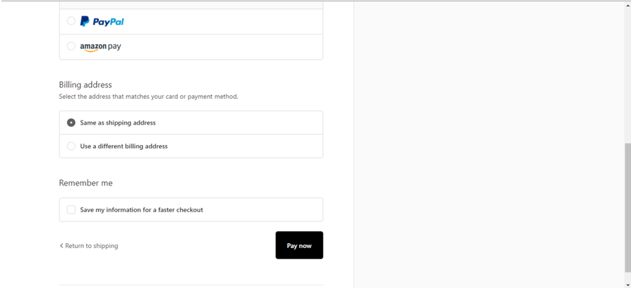
Ensure There Are No Hidden Costs
Hidden costs are shockingly bad for securing final sales. And even if a sale does go through, there’s a massive chance that the customer will back out on the sale once they realize the extra cost. Hidden costs are mainly things like shipping fees. But tax also comes into account. Remember, the US is unique tax duty being added at checkout. Therefore you need to be as transparent as possible in the build up to the sale.
.png?width=700&name=image%202-1%20(1).png)
Above: the dreaded “calculated at next step”
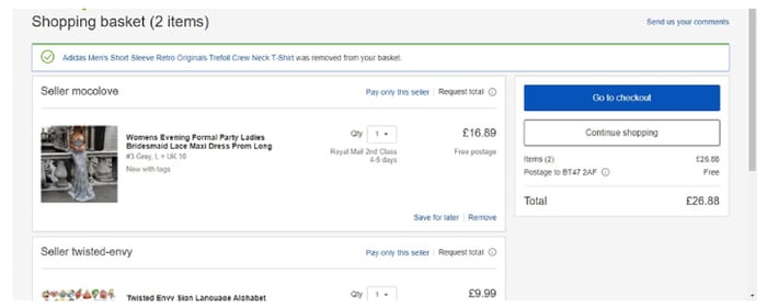
Streamline Distractions
The closer you get to the point of sale, the less you want on the screen distracting users from carrying through with what they set out to do. “Your website should have a visual funnel to complement your sales funnel, a removal of unnecessary and distracting links as you get closer and closer to the sale”, explains Priti Robinson, marketer at Australianhelp and PaperFellows. In testing your checkout, you could experiment with removing the navigation bar. This forces users to back out wholeheartedly if they are going to be distracted at all. You may be thinking to yourself how it’s useful to advertise other products to potentially increase the value of the order. This is true, but just like how physical stores put small, easily accessible add-ons next to the checkout line, you should only have options or other products that can be added directly to your customer’s basket, without needing to leave and reconsider their whole purchase. Cutting out these extras will greatly help your checkout process.
.png?width=588&name=image%203%20(1).png)
Above: a slightly distracting checkout, with related items shown – the user is likely to go round in circles, abandoning their cart in this way.
Simplify Form Layout To Reduce Stress
When a customer comes to the point of checkout and is required to fill out forms they are facing something of a necessary evil. But, only to a certain extent. If the e-commerce purchase is being mailed to a recipient then, of course, an address is needed. However, you should always be looking for ways to keep things easy. Always have a button for duplicating the billing address for the delivery, to save the extra work. Don’t ask more questions than are necessary, or require more of your customer than is absolutely necessary. Try it yourself as you test: if you ever feel like you’re typing too much or you’re slightly frustrated or confused by the form layout, you’ve identified a problem.
Above: this site lets you use the same billing and shipping address. Offering PayPal is almost a part of simplifying the form layout, because now the user won’t have to input so many card details.
-1.png?width=792&name=image%205-1%20(1)-1.png)
The above form offers one input field for email or phone number that even automatically detects the number’s region, greatly simplifying checkout.
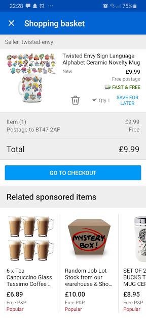
Let Users Edit On The Go
Keep the cart flexible all the way up to the click of the checkout button. A bit like what we discussed earlier with being able to add easily accessible add-ons to your purchase, you also need to keep the shopping cart flexible. On some sites, the moment you click proceed to checkout, you enter a new dimension. A heavy door slams shut behind you, locking you and the cart into the purchase process. Consumers hate to feel boxed in. You always need to give them the option to adapt and alter their cart - adding or removing items, or editing smaller details like colors or sizes as they go.
This site’s checkout only lets you change the quantity, though there are style options available.
However, you can still access an identical page from mobile, if you sign in to your account.
Use A/B Testing
A/B testing is a very simple concept that can be extremely valuable. Its use in this instance is to acknowledge that there’s more than one way to do a checkout page. For anything you are torn over, use A/B testing to line up your two options side-by-side and proceed from there.
Test For Speed Of Response
Responsiveness will be vital for your checkout page. Slow speeds make customers think something is going wrong. This is a surefire way to send them packing. Analyze the user experience. How responsive your checkout is and unearthing where improvements can be made is a job for a pro, either a web developer or an outside software.
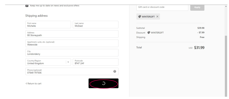
A dubiously slow page, to a customer.
Conclusion
Overall, you can see why there is great value in testing this point in your e-commerce site. It’s the crucial moment and an area which, if you get it wrong, can dash your e-commerce company’s hopes and dreams.
Author
Beatrix Potter is a professional business writer, working at Personal Statement Online and Essay Service. Bea writes about e-commerce and conversion rates. Also, she is an online teacher at Essayroo Review service.
