Contrary to popular perception, email marketing is fast becoming the most influential digital marketing channel for businesses as they continue to innovate and evolve their email game. Emails cater an exclusive screen presence as opposed to every other platform flooded with multiple businesses fighting for attention on the same screen. I find that sending out plain emails is no longer an option, and you need to innovate for keeping up with this powerful digital marketing platform. Interactive email templates attract businesses and subscribers alike.
Interactivity can increase your CTR by 73%, and this is enough motivation to start using it right away. Today I am going to discuss how you can innovate your email designs with interactivity. HubSpot is one of the best inbound marketing solutions available. It has recently rolled out its email marketing tool. Since there are a lot of people who are already using HubSpot solutions, we will also cover it as we move ahead. Read this article to know the interactivity tips and tricks shared by industry insiders.
Carousel Effect
Among all interactive email designs, the carousel effect has its special place due to extensive utility. You can use it in your email templates for displaying a number of products without making your subscribers scroll. This means that your call-to-action (CTA) button remains accessible at all times. Another benefit of using the carousel effect is that you can pack more information without overwhelming your readers. It is an industry best practice to include at most five images in clearly distinguishable frames.
This helps your subscribers navigate easily through the displayed images, and adding a separate CTA button customized for the particular frame helps them take action on will. The carousel effect in HubSpot works well for most of the templates. You only need to add the images from the image gallery into the image slider module provided in the email builder. Here's an example of HP using interactivity in a Salesforce email template, which can give a near to social media experience:

Hamburger Menus
Hamburger menus are another example of making smart use of available spacing. Especially mobile-optimized HTML emails use the hamburger menu extensively as they help keep all navigation tabs under reach while allowing the users to interact with the email just like their website. Keeping the email design consistent with the website using a hamburger menu enables you to turn your message into a miniature website, and mimicking your own site is a great way of driving engagement.
This method is used when the number of frames exceeds five. They are also known as collapsible menus as they replace scrolling with direct access navigation. Readers love collapsible menus as they can easily cut through the clutter and access the content they are looking for. You can insert the CSS code for the hamburger menu after coding the HTML. But HubSpot email builder comes with pre-built hamburger menus, making the job easy for you.
Hover Effects
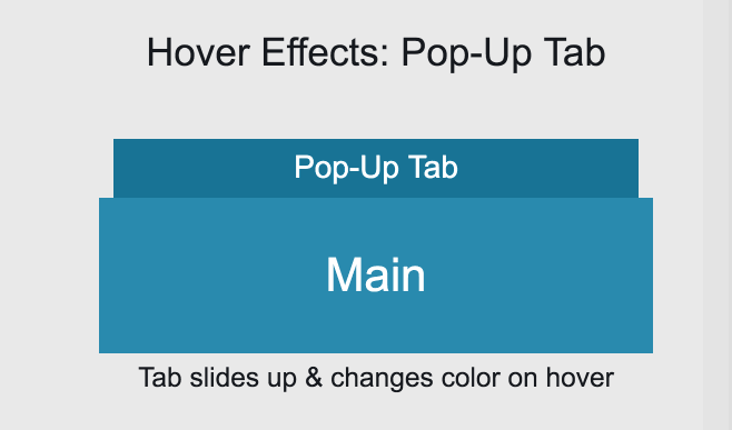
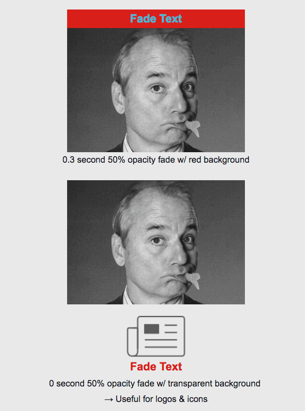
Hover effects are very popular with email marketers as they allow introducing interactivity in the simplest way. You can give various effects to email body elements when the cursor hovers them, which includes text, image fading, background images, and motion. It would help if you embedded the CSS styling to the HTML element for implementing them. You can highlight various portions of your email message with the help of hover effects and even create transitions. Most inbox providers support them, but you need to be creative with your copy in order to benefit from them. Here are a few examples of hover effect in emails:


As you can see, you need to include the transitions as a part of your copy. This gives great results for minimalistic designs. To create a hover effect in HubSpot email builder, you just need to add the second image and input the desired text into the div of the concerned class with text.
Interactive Quizzes
Opinion polls, quizzes, and surveying, including pulse surveys, can now be run inside the email body. You no longer need to run an email campaign and build landing pages to gather your subscribers' opinions. With the help of interactive elements, you can run interactive quizzes inside the message, and this improves your odds of sourcing the information. Your subscribers don't need to go to your website for completing the quiz/survey, and thus, they will feel that taking up the survey wouldn't waste much of their time.
I recommend running short surveys while you can also display live ratings. Interactive quizzes also use the above-mentioned hover effects to make the process more intuitive. You can also embed countdown timers as interactive quizzes allow a lot of permutations and combinations.
Things To Keep In Mind While Using Interactivity In Emails
Of course, using interactivity opens new horizons to innovation and captures your subscribers' attention, but coding interactive emails is no walk in the garden. Even for the most experienced email developers, it takes a lot of time and effort to combine interactivity with the email templates and the copy. One of the major reasons behind this is that every inbox provider doesn't support all sorts of interactivity.
You need to be very careful while selecting the interactive elements and always plan for fallback elements. This helps you engage your readers even if their mailbox doesn't support interactivity. You also need to devise tailored metrics for such emails and plan your campaigns accordingly. These are some points you need to keep in mind while innovating with dynamic content.
Summing Up
It seems that businesses are getting more innovative with each passing year when it comes to email marketing. Right from small games to near website experience, brands are experimenting with a lot of interactive elements, and mailbox providers will also improve their support for search elements in the days to come. Interactive emails produce twice as many conversions as compared to passive ones. You can also mix and match these interactive elements to create entirely new features for your message.
Author Bio
Kevin George is Head of Marketing at Email Uplers, one of the fastest growing custom email design and coding companies that specializes in professional email template creation and PSD to HTML email conversion; they are Marketo certified associates. Kevin loves gadgets, bikes, jazz and eats and breathes email marketing. He enjoys sharing his insights and thoughts on email marketing best practices on his blog.

Contrary to popular perception, email marketing is fast becoming the most influential digital marketing channel for businesses as they continue to innovate and evolve their email game. Emails cater an exclusive screen presence as opposed to every other platform flooded with multiple businesses fighting for attention on the same screen. I find that sending out plain emails is no longer an option, and you need to innovate for keeping up with this powerful digital marketing platform. Interactive email templates attract businesses and subscribers alike.
Interactivity can increase your CTR by 73%, and this is enough motivation to start using it right away. Today I am going to discuss how you can innovate your email designs with interactivity. HubSpot is one of the best inbound marketing solutions available. It has recently rolled out its email marketing tool. Since there are a lot of people who are already using HubSpot solutions, we will also cover it as we move ahead. Read this article to know the interactivity tips and tricks shared by industry insiders.
Carousel Effect
Among all interactive email designs, the carousel effect has its special place due to extensive utility. You can use it in your email templates for displaying a number of products without making your subscribers scroll. This means that your call-to-action (CTA) button remains accessible at all times. Another benefit of using the carousel effect is that you can pack more information without overwhelming your readers. It is an industry best practice to include at most five images in clearly distinguishable frames.
This helps your subscribers navigate easily through the displayed images, and adding a separate CTA button customized for the particular frame helps them take action on will. The carousel effect in HubSpot works well for most of the templates. You only need to add the images from the image gallery into the image slider module provided in the email builder. Here's an example of HP using interactivity in a Salesforce email template, which can give a near to social media experience:

Hamburger Menus
Hamburger menus are another example of making smart use of available spacing. Especially mobile-optimized HTML emails use the hamburger menu extensively as they help keep all navigation tabs under reach while allowing the users to interact with the email just like their website. Keeping the email design consistent with the website using a hamburger menu enables you to turn your message into a miniature website, and mimicking your own site is a great way of driving engagement.
This method is used when the number of frames exceeds five. They are also known as collapsible menus as they replace scrolling with direct access navigation. Readers love collapsible menus as they can easily cut through the clutter and access the content they are looking for. You can insert the CSS code for the hamburger menu after coding the HTML. But HubSpot email builder comes with pre-built hamburger menus, making the job easy for you.
Hover Effects
Hover effects are very popular with email marketers as they allow introducing interactivity in the simplest way. You can give various effects to email body elements when the cursor hovers them, which includes text, image fading, background images, and motion. It would help if you embedded the CSS styling to the HTML element for implementing them. You can highlight various portions of your email message with the help of hover effects and even create transitions. Most inbox providers support them, but you need to be creative with your copy in order to benefit from them. Here are a few examples of hover effect in emails:


As you can see, you need to include the transitions as a part of your copy. This gives great results for minimalistic designs. To create a hover effect in HubSpot email builder, you just need to add the second image and input the desired text into the div of the concerned class with text.
Interactive Quizzes
Opinion polls, quizzes, and surveying, including pulse surveys, can now be run inside the email body. You no longer need to run an email campaign and build landing pages to gather your subscribers' opinions. With the help of interactive elements, you can run interactive quizzes inside the message, and this improves your odds of sourcing the information. Your subscribers don't need to go to your website for completing the quiz/survey, and thus, they will feel that taking up the survey wouldn't waste much of their time.
I recommend running short surveys while you can also display live ratings. Interactive quizzes also use the above-mentioned hover effects to make the process more intuitive. You can also embed countdown timers as interactive quizzes allow a lot of permutations and combinations.
Things To Keep In Mind While Using Interactivity In Emails
Of course, using interactivity opens new horizons to innovation and captures your subscribers' attention, but coding interactive emails is no walk in the garden. Even for the most experienced email developers, it takes a lot of time and effort to combine interactivity with the email templates and the copy. One of the major reasons behind this is that every inbox provider doesn't support all sorts of interactivity.
You need to be very careful while selecting the interactive elements and always plan for fallback elements. This helps you engage your readers even if their mailbox doesn't support interactivity. You also need to devise tailored metrics for such emails and plan your campaigns accordingly. These are some points you need to keep in mind while innovating with dynamic content.
Summing Up
It seems that businesses are getting more innovative with each passing year when it comes to email marketing. Right from small games to near website experience, brands are experimenting with a lot of interactive elements, and mailbox providers will also improve their support for search elements in the days to come. Interactive emails produce twice as many conversions as compared to passive ones. You can also mix and match these interactive elements to create entirely new features for your message.
Author Bio
Kevin George is Head of Marketing at Email Uplers, one of the fastest growing custom email design and coding companies that specializes in professional email template creation and PSD to HTML email conversion; they are Marketo certified associates. Kevin loves gadgets, bikes, jazz and eats and breathes email marketing. He enjoys sharing his insights and thoughts on email marketing best practices on his blog.