Email marketing is a wonderful part of the digital marketing of products and services. This marketing tool has been around for a long time. It has become a copywriting art form to a large extent, and email marketing has been largely successful.
When correctly planned and implemented as part of a bigger content marketing plan, email marketing proves to be a valuable sales measure.
Unfortunately, many marketers have not yet understood the basics of email marketing etiquette. The uninitiated are enthusiastic about their marketing copy.
They have employed the services of an excellent writer to create appealing copy, and they have implemented several workable advertising strategies to supplement their email campaigns.
The success of this element of the marketing campaign all falls away when some common email signature mistakes are incorporated. These are easily avoidable, and these guidelines can help to significantly improve your ad campaigns.
Email signature booboo’s and how they hurt your sales
Here are some of the most common email signature mistakes made by businesses, which should be avoided at all costs.
The reasons that these examples are mistakes is because they typically cost time, money or effort to download and annoy your customers. That, of course, is the last thing you want or need when investing money in successful initiatives in other areas of your ad campaign.
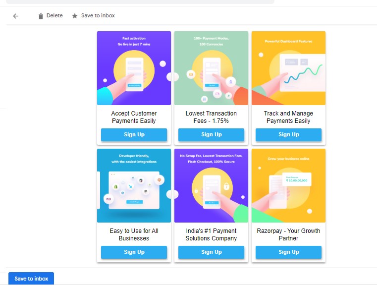
No icons – Keep it simple like Razorpay emails! A simple option save to ‘Inbox’ and that’s all.
Adding all your social media and other icons
Yep – we know you’re incredibly busy and industrious as a small business owner, but truly? We would rather work smart than long and hard on elements that waste time.
Including a logo for every social media site where you are trying to establish a presence or have managed (miraculously) to make your mark is wonderful. Congratulations! The harsh fact though, is that your customers aren’t interested.
Unless they are invested in following any one of your social media sites or can benefit from a personal face to face business call via video, don’t include these icons.
By adding these, your email takes forever to download, takes up unnecessary time and is just plain annoying. Don’t bother to include any of these icons because your loyal customers know where to find your website.
Unless we did a time warp back to the 1980s, don’t use a fax number
Seriously, who even uses fax numbers anymore? When customers receive an email with a fax number, it looks unprofessional. Why? Because it is so outdated, looks ancient, and you’re using their email to communicate with them, which makes a fax number redundant. Don’t do it.
Adding a fax number doesn’t complement the professional appearance of your email. It doesn’t look impressive, and it is just downright embarrassing in the 3rd decade of the 21st century.
Why would any professional add their email address to their signature? Isn’t it obvious to the recipient that the email address is the one being used to communicate your marketing efforts with? Adding the email address simply sends the message that you’re incompetent or worse, that you think your customers are not particularly bright.
Stop doing it. Should you be using an alternate address to send them an email for some reason or want them to respond to another email address, use that one. That would be professional and convenient for them. After all, their convenience is more important than yours in this scenario.
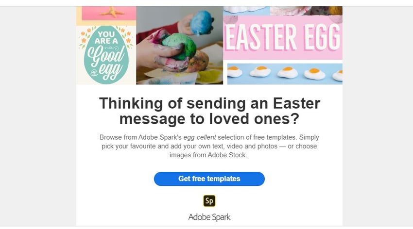
Keep it simple – Like Adove does – No loud images, just the icon to ‘get free templates’
Cutsie wootsie images
NO! You are not in kindergarten. As tempting as it may be to exercise your creative juices while playing around with amateurish graphics, your email signature is not the place to do it. It’s pretty – but it’s not professional, so stop it right now.
You are running a business, so your communications need to reflect this. Show respect for your customers who are also often professionals or most certainly won’t all share your passion for cute little images at the bottom of your professional email sales letter, encouraging them to purchase your product.
Even Pinterest does not use creative images on email signatures, rather the company keeps it simple and down to the essentials. Some companies have even reduced a huge pop of color on the email signature they are using and stuck to simple colors relevant to the business. Undoubtedly, this has boosted their professionalism and company image exponentially.
All that hard work and money invested in your email sales campaigns just falls away when the customer reaches the end of the email and sees something like this. Resist the temptation at all costs. As seen on essay writing service reviews, an online dissertation service looks beautiful and appealing to the audience with an image of the writer and not with some random pen and laptop image there.
More unprofessional graphics
This is one of those instances where you can appreciate that graphics are more memorable than text. People – your customers appreciate images, and they remember them.
The question then is, why would you include a beautiful image of a serene landscape or a family photo in your signature. The answer is to stop doing this.
Again, the answer is because useless graphics take a long time to download, no matter how much you enjoy creating them and adding these to your signature. Family pictures are also unprofessional. They may be interesting, and you are probably very proud of your family, but don’t express it in this forum.
Using logos that are not transparent or with borders can tarnish the company image of the small business and hurt its sales. You can use this tip just like Sweetgreen since their email signature includes a beautiful transparent logo that well represents the company. The colors also complement each other which are tips you can use if the email signature chosen by the company requires a logo.
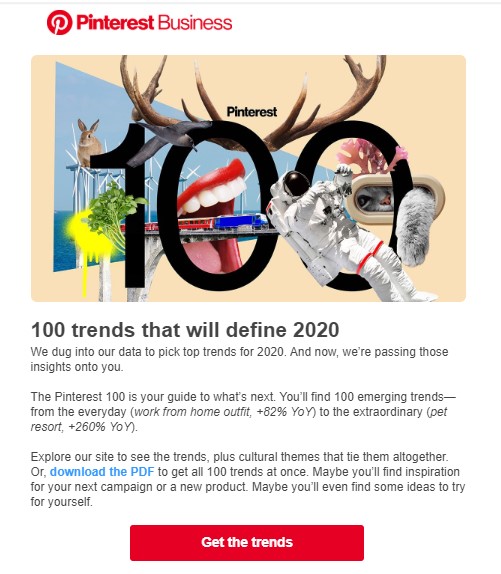
No clever quote. Pinterest means business!
The other mistake to avoid is the “clever quote”
We’ve all received those emails with that inspiring, clever, motivational quote at the bottom. You all know the one’s I’m talking about. They do sound inspiring and motivational at times, but this is a commercial communication that you’re sharing.
This marketing email is not going to your best friend, it’s going out to your customers. As a business owner, it is important to remember this. Remain professional at all times because the quote you use in your signature may just be the words that cost you sales.
The chances are that your customers come from different cultural backgrounds, so the quote that you’re so fond of might be meaningful or meaningless to them.
It’s fluff. Leave it out unless you’re a life coach and it’s your business to sell inspiration and motivation. Your focus should be on selling your product. Stick to your expertise and use that to your advantage.
Successful companies like PayPal do not include unnecessary fluff word in their emails but just include their essential details such as an address and contact details. You should also refrain from using them or any other unnecessary text.

Love for customers – The Airbnb way!
Airbnb has used the space others use for clever quotes to include a heartily message. They include a small cute text that reads “with love from Airbnb”. Instead of using clever quotes, consider using lovely messages like this one to express love and gratitude to your customers.
Overstuffing in your signature is unprofessional
We’ve also seen those verbose email signatures that are so long, they threaten to outweigh the marketing message intended to attract customer attention. Your 5 degrees and advertising courses are not the highlight here.
Your trip to Italy and the ability to sniff out five different wines is unimportant. You are not the star of this show, your customers are – so learn to keep it that way and maintain focus on the end prize. Your ultimate outcome is to attract more customers, not scare them off with an overstuffed email signature like this.
How to get the right email signature balance
Follow these expert tips on how to generate the professional email signature. This is typically simple, to the point, doesn’t contain unnecessary fluff and includes a call to action.
Add the basic details and contact number together with a few social media icon links. You may even include your area of expertise in your signature for additional credibility.
Personalizing your email signature
Keep it simple and professional. Include your first name and surname. Add your business name, include your phone number, including your international prefix for global customers. Personalize your signature by adding your 2 to 4 (maximum) social media icon links.
Although almost all millennials know Twitter, they still use their names when communicating with users. Email signatures the Twitter employees use include their name and surname making the encounter feel more personal. Smaller businesses add a telephone number and the company name also, emails with this information are perceived very professional with a slight touch of brand personality.
Add your area of expertise
Your small business may specialize in roofing products, and you may have certification to prove this. Include that in your signature. Or, you may have sold over 1,000,000 fiction e-books on Amazon, so you can do a little subtle bragging about this to impress your following.
Maybe you’re a professional essay writer who provides assignment writing, a lawyer or an accountant, then you can include these credentials in your email signature to build confidence and trust.
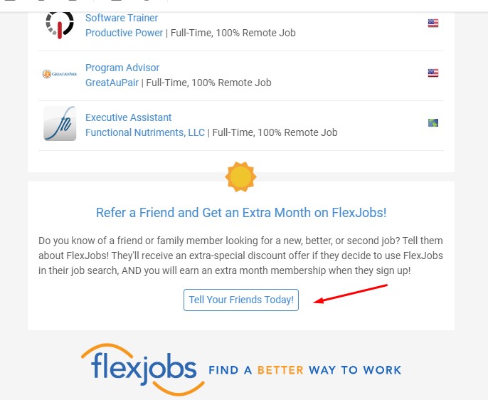
Newsletter with a crisp CTA. Serves dual purpose with one email!
The important call to action
Your email copy may already have a call to action written into your sales pitch. If you also have a slogan that doubles as a call to action, then it is okay to include this in your email signature. As long as it is short and professional, this CTA can enhance your signature rather than detracting from it.
OpenTable includes a CTA on their email signatures that prompts users to visit the company website. You can also imitate how they use CTAs since they stage a short question asking if users have any questions. The question is then followed by a brief yet effective CTA saying “Visit community.opentable.com”
Want to really make an impression with your email signature?
To really personalize your email signature, instead of adding a pretty mountain image – include a pic of your face. A picture of what you look like will personalize your email signature for your customers. Now, they know who they’re speaking with via email or over the phone. They can put a picture to the website that they’re doing business with.
The baseline
The short and sweet of creating the perfect email signature is to include basic information. Your name, business logo, phone number and social media icons together with a photo of yourself exudes a professional yet friendly air.
Add excellent sales copy to your email communications and you have a winning combination. Overstuff your signature with unnecessary padding, and you lose credibility – and customers. Find the perfect balance for your business to promote success.
Author Bio:
Scott Mathews is a freelance academic essay writer and research writer at UK assignment help and Superior essay writers. His job is to provide instant assignment help to students who need writing work done on various subjects. When he’s not busy writing, he spends time with his gaming community on Twitch.


Email marketing is a wonderful part of the digital marketing of products and services. This marketing tool has been around for a long time. It has become a copywriting art form to a large extent, and email marketing has been largely successful.
When correctly planned and implemented as part of a bigger content marketing plan, email marketing proves to be a valuable sales measure.
Unfortunately, many marketers have not yet understood the basics of email marketing etiquette. The uninitiated are enthusiastic about their marketing copy.
They have employed the services of an excellent writer to create appealing copy, and they have implemented several workable advertising strategies to supplement their email campaigns.
The success of this element of the marketing campaign all falls away when some common email signature mistakes are incorporated. These are easily avoidable, and these guidelines can help to significantly improve your ad campaigns.
Email signature booboo’s and how they hurt your sales
Here are some of the most common email signature mistakes made by businesses, which should be avoided at all costs.
The reasons that these examples are mistakes is because they typically cost time, money or effort to download and annoy your customers. That, of course, is the last thing you want or need when investing money in successful initiatives in other areas of your ad campaign.

No icons – Keep it simple like Razorpay emails! A simple option save to ‘Inbox’ and that’s all.
Adding all your social media and other icons
Yep – we know you’re incredibly busy and industrious as a small business owner, but truly? We would rather work smart than long and hard on elements that waste time.
Including a logo for every social media site where you are trying to establish a presence or have managed (miraculously) to make your mark is wonderful. Congratulations! The harsh fact though, is that your customers aren’t interested.
Unless they are invested in following any one of your social media sites or can benefit from a personal face to face business call via video, don’t include these icons.
By adding these, your email takes forever to download, takes up unnecessary time and is just plain annoying. Don’t bother to include any of these icons because your loyal customers know where to find your website.
Unless we did a time warp back to the 1980s, don’t use a fax number
Seriously, who even uses fax numbers anymore? When customers receive an email with a fax number, it looks unprofessional. Why? Because it is so outdated, looks ancient, and you’re using their email to communicate with them, which makes a fax number redundant. Don’t do it.
Adding a fax number doesn’t complement the professional appearance of your email. It doesn’t look impressive, and it is just downright embarrassing in the 3rd decade of the 21st century.
Why would any professional add their email address to their signature? Isn’t it obvious to the recipient that the email address is the one being used to communicate your marketing efforts with? Adding the email address simply sends the message that you’re incompetent or worse, that you think your customers are not particularly bright.
Stop doing it. Should you be using an alternate address to send them an email for some reason or want them to respond to another email address, use that one. That would be professional and convenient for them. After all, their convenience is more important than yours in this scenario.

Keep it simple – Like Adove does – No loud images, just the icon to ‘get free templates’
Cutsie wootsie images
NO! You are not in kindergarten. As tempting as it may be to exercise your creative juices while playing around with amateurish graphics, your email signature is not the place to do it. It’s pretty – but it’s not professional, so stop it right now.
You are running a business, so your communications need to reflect this. Show respect for your customers who are also often professionals or most certainly won’t all share your passion for cute little images at the bottom of your professional email sales letter, encouraging them to purchase your product.
Even Pinterest does not use creative images on email signatures, rather the company keeps it simple and down to the essentials. Some companies have even reduced a huge pop of color on the email signature they are using and stuck to simple colors relevant to the business. Undoubtedly, this has boosted their professionalism and company image exponentially.
All that hard work and money invested in your email sales campaigns just falls away when the customer reaches the end of the email and sees something like this. Resist the temptation at all costs. As seen on essay writing service reviews, an online dissertation service looks beautiful and appealing to the audience with an image of the writer and not with some random pen and laptop image there.
More unprofessional graphics
This is one of those instances where you can appreciate that graphics are more memorable than text. People – your customers appreciate images, and they remember them.
The question then is, why would you include a beautiful image of a serene landscape or a family photo in your signature. The answer is to stop doing this.
Again, the answer is because useless graphics take a long time to download, no matter how much you enjoy creating them and adding these to your signature. Family pictures are also unprofessional. They may be interesting, and you are probably very proud of your family, but don’t express it in this forum.
Using logos that are not transparent or with borders can tarnish the company image of the small business and hurt its sales. You can use this tip just like Sweetgreen since their email signature includes a beautiful transparent logo that well represents the company. The colors also complement each other which are tips you can use if the email signature chosen by the company requires a logo.

No clever quote. Pinterest means business!
The other mistake to avoid is the “clever quote”
We’ve all received those emails with that inspiring, clever, motivational quote at the bottom. You all know the one’s I’m talking about. They do sound inspiring and motivational at times, but this is a commercial communication that you’re sharing.
This marketing email is not going to your best friend, it’s going out to your customers. As a business owner, it is important to remember this. Remain professional at all times because the quote you use in your signature may just be the words that cost you sales.
The chances are that your customers come from different cultural backgrounds, so the quote that you’re so fond of might be meaningful or meaningless to them.
It’s fluff. Leave it out unless you’re a life coach and it’s your business to sell inspiration and motivation. Your focus should be on selling your product. Stick to your expertise and use that to your advantage.
Successful companies like PayPal do not include unnecessary fluff word in their emails but just include their essential details such as an address and contact details. You should also refrain from using them or any other unnecessary text.

Love for customers – The Airbnb way!
Airbnb has used the space others use for clever quotes to include a heartily message. They include a small cute text that reads “with love from Airbnb”. Instead of using clever quotes, consider using lovely messages like this one to express love and gratitude to your customers.
Overstuffing in your signature is unprofessional
We’ve also seen those verbose email signatures that are so long, they threaten to outweigh the marketing message intended to attract customer attention. Your 5 degrees and advertising courses are not the highlight here.
Your trip to Italy and the ability to sniff out five different wines is unimportant. You are not the star of this show, your customers are – so learn to keep it that way and maintain focus on the end prize. Your ultimate outcome is to attract more customers, not scare them off with an overstuffed email signature like this.
How to get the right email signature balance
Follow these expert tips on how to generate the professional email signature. This is typically simple, to the point, doesn’t contain unnecessary fluff and includes a call to action.
Add the basic details and contact number together with a few social media icon links. You may even include your area of expertise in your signature for additional credibility.
Personalizing your email signature
Keep it simple and professional. Include your first name and surname. Add your business name, include your phone number, including your international prefix for global customers. Personalize your signature by adding your 2 to 4 (maximum) social media icon links.
Although almost all millennials know Twitter, they still use their names when communicating with users. Email signatures the Twitter employees use include their name and surname making the encounter feel more personal. Smaller businesses add a telephone number and the company name also, emails with this information are perceived very professional with a slight touch of brand personality.
Add your area of expertise
Your small business may specialize in roofing products, and you may have certification to prove this. Include that in your signature. Or, you may have sold over 1,000,000 fiction e-books on Amazon, so you can do a little subtle bragging about this to impress your following.
Maybe you’re a professional essay writer who provides assignment writing, a lawyer or an accountant, then you can include these credentials in your email signature to build confidence and trust.

Newsletter with a crisp CTA. Serves dual purpose with one email!
The important call to action
Your email copy may already have a call to action written into your sales pitch. If you also have a slogan that doubles as a call to action, then it is okay to include this in your email signature. As long as it is short and professional, this CTA can enhance your signature rather than detracting from it.
OpenTable includes a CTA on their email signatures that prompts users to visit the company website. You can also imitate how they use CTAs since they stage a short question asking if users have any questions. The question is then followed by a brief yet effective CTA saying “Visit community.opentable.com”
Want to really make an impression with your email signature?
To really personalize your email signature, instead of adding a pretty mountain image – include a pic of your face. A picture of what you look like will personalize your email signature for your customers. Now, they know who they’re speaking with via email or over the phone. They can put a picture to the website that they’re doing business with.
The baseline
The short and sweet of creating the perfect email signature is to include basic information. Your name, business logo, phone number and social media icons together with a photo of yourself exudes a professional yet friendly air.
Add excellent sales copy to your email communications and you have a winning combination. Overstuff your signature with unnecessary padding, and you lose credibility – and customers. Find the perfect balance for your business to promote success.
Author Bio:
Scott Mathews is a freelance academic essay writer and research writer at UK assignment help and Superior essay writers. His job is to provide instant assignment help to students who need writing work done on various subjects. When he’s not busy writing, he spends time with his gaming community on Twitch.